Article taken from: BloggerBuster
In this tutorial, I'll explain how to create a three column template in
Blogger layouts, using the Minima template as a starting point.
The Minima template is the easiest Blogger
template to customise, as this is the simplest two column template, and
has few parameters regarding margins, padding and the like. Once you
have developed the third column, it will then be easier to alter
font-size, colours and such so leave this until later on. We're going
to concentrate on the actual layout first.
First of all, set your template to Minima (not the stretch template, but any colour will do!), then follow these instructions:#sidebar-wrapper {
width: 220px;
float: right;
word-wrap: break-word; /* fix for long text breaking sidebar float in IE */
overflow: hidden; /* fix for long non-text content breaking IE sidebar float */
}
Copy this entire section, and paste it directly below. We're going to
change the elements I've highlighted in red to the following:#left-sidebar-wrapper (this makes the css for this section unique)
float: left (this will make the new sidebar float to the left of the main column)
This will provide the styling for the new sidebar element which we will create next.<div id='main-wrapper'>
.
Immedietly before this section, you should paste the following piece of code:<div id='left-sidebar-wrapper'>
<b:section class='sidebar' id='left-sidebar' preferred='yes'/>
</div&gt;
Let me explain the elements of this code to help you understand what we've just done:
section tells the browser that the left-sidebar element exists here,
and to look in the css for the appropriate styling for this element.
This tells the browser the class of the sidebar element and all other
elements (widgets) which may be included in this section. The ID of
this element must be "left-sidebar" in order to make it unique,
otherwie this would cause problems when viewing. It is preferred so
that it will feature in the layout, even if no widgets are placed
within it.
sidebar will be beneath the main section at the moment. This is because
the outer-wrapper is still only wide enough to accomodate one sidebar.
So now we need to expand the oputer wrapper to accomodate this new
sidebar.
Find this section in the HTML code:/* Outer-Wrapper
We
----------------------------------------------- */
#outer-wrapper {
width: 660px;
margin:0 auto;
padding:10px;
text-align:left;
font: $bodyfont;
}
need to increase the width of the wrapper by the width of the
left-sidebar-wrapper, in this case 220px. So, change the value in red
to 880px.#header-wrapper {
width:880px;
margin:0 auto 10px;
border:1px solid $bordercolor;
}
sidebar will not be seen as there are no widgets contained within it,
though it will still be present in the markup of the page. Once you
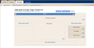
have saved your template, go to Template>Page elements in your
Blogger dashboard.
You can now add a page element (or two) to your new left sidebar.
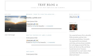
sidebar, you will probably notice that it jams right up to the main
section, like this: This
This
is because there is no space defined between the left-sidebar and the
main section. We need to create this space in the template's HTML.
To do this, we will add a margin to the left hand side of the main
posts section. Find the following code in your template's HTML and add
the code defined in red:#main-wrapper {
This
width: 410px;
float: left;
margin-left: 20px;
word-wrap: break-word; /* fix for long text breaking sidebar float in IE */
overflow: hidden; /* fix for long non-text content breaking IE sidebar float */
}
defines a margin space of 20px between the left-sidebar and the main
column. You should also ensure you adjust thw width of the
outer-wrapper from 880px to 900px to ensure the width of your blog is
enough to accomodate this margin too. Either that, or you could reduce
the width of your main column/a sidebar by 20px to serve the same
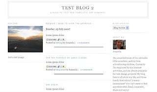
purpose. Now, your previewed template should look more like this:
The
same principles described here can help you create a three column
template from any Blogger template, though you may find that you'll
need to adjust the width, margins and padding for your new sidebar in
order for it to look the way you would like.
Also, you can
configure your new sidebar to float to the right, and have two sidebars
on the right of the main column if you prefer. Simply set the CSS of
your new sidebar to float: right; instead.
Here is a download of
the three column Minima template for reference (or if you prefer to use
a preconfigured template instead!):
Download 3 column Minima template
For more Blogger templates to download, please have a look through the Templates section here at Blogger Buster.


No comments:
Post a Comment